Buttons & Menus
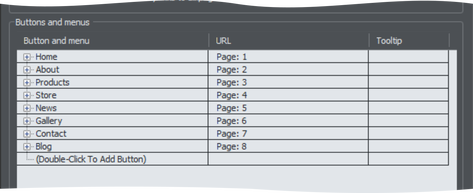
Edit the button labels, links and other button attributes using the table and tree controls in the lower half of the Navigation bar properties dialog. Each row in the table corresponds to a button in the bar, or to an entry in a menu under one of the buttons.
Adding & editing buttons
To add a button, double click in the first column where it says "Double-Click To Add Button". A new row is added below the row for the last button. Or click the Add button at the bottom of the dialog to add a button following the selected button. You can immediately start editing the label for the new button. Press return to complete the label edit, or click away from the label.
You can edit any button label by first clicking the appropriate row to select it and then clicking again in the first column to start editing the label.
To set the link on a button, double click on the URL field, or if the row is already selected you can just single click on it. The Web Properties Link dialog appears. This should look familiar as it's the same Link dialog that you use for adding other links to your page, so you have the same link options available. A few options are disabled because they are not applicable to NavBar and menu links, such as the pop-up photo option which only works when applied to a photo.
You can also set the tooltip text for each button using the 3rd column. Edit the text the same way as you edited the label text. In the exported web site the text entered appears as a small pop-up tooltip when the mouse pointer is held over your button or menu entry.
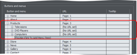
Adding menus and sub-menus
In the first (label) column, you'll notice that there is a plus icon  to the left of each label. This is a tree control and clicking the plus icon next to a button label, expands that button node, allowing you to add a menu to that button.
Click on the Double-Click To Add Menu Item text below the button to start adding a menu. Or click the Add button at the bottom of the dialog to add a menu item below the selected item. A new row appears in the table for each menu entry you add. You set the label, link and tooltip for each menu entry the same way you do for buttons. And you can add sub-menus to any menu the same way – by first expanding the menu entry node of the tree.
Note that users with touch screen devices will not be able to see menu items if the top level button has a link attached. This is because a touch action on the linked button will invoke the link rather than displaying the underlying menu. If this is the case, a warning will appear to tell you that you have a button with both a link and a menu attached and offering you the option to remove the button link.
Menu separators
You can add a separator into your menu by clicking the Add separator button at the bottom of the dialog. The separator is added following the currently selected menu item. Separators allow you to visually group together related items in your menu.
Menu Styles
Click on the Pop-Up Menu Style... button to bring up the Menu Style dialog. This allows you to change how the NavBar menus appear and behave.
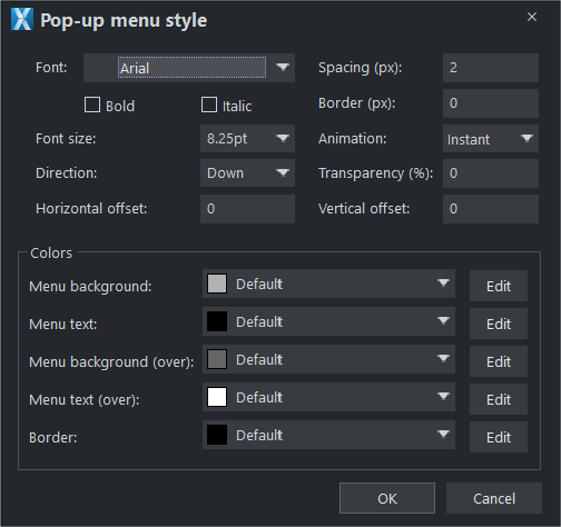
Font
Choose a font to be used for the text on your menus from the dropdown Font list, which includes Google Fonts.
NOTE: This doesn't change the font used for the button labels of your bar, only the font used on menus. To change the button label font, see the information in Navigation bar properties dialog article.
Direction
Choose the direction in which your menus should open. For horizontal NavBars you'll normally want this to be downwards and for vertical bars either left or right depending on where on the page your bar is located.
Spacing
With this setting you can add space between the entries in your menu, spreading them out and making the menu larger as a result.
Border
Add a border to the panes of your menus by entering a border width in pixels.
Animation
By default menus will open instantly, but here you can choose to have the menu animating as it opens.
Transparency
You can choose to have your menus semi-transparent, so that your page can be seen through the menu panes. Enter the level of transparency you would like as a percentage.
Horizontal offset / Vertical offset
You can offset the menu panes horizontally or vertically from the buttons. Just enter the number of pixels of offset required.
Copyright © Xara