Creating Responsive Website Designs (RWD) from existing sites
To create a variant of an existing website you will need to open the Website variants dialog - any of the following steps will do this:
- Click "Utilities" > "Website variants" >"Website variants".
- Right-click on the document tab and select "Website variants" to open the dialog and also to view your variants.
- Right click anywhere in the document work area and select "Website variants" > "Website variants" to view the dialog.
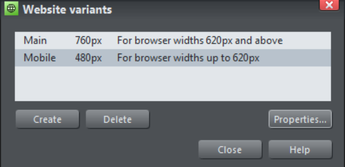
Website variants dialog
Click the Create button and choose a design width in pixels. The two variants above describe webpages of 760 pixels for the larger Main variant, and a Mobile variant which has default pixel width of 480 pixels. What happens is that a visiting web browser with a width of 620 pixels or greater will see the Main variant, whilst a browser with a width less than 620 pixels will see the Mobile variant.
You can view and edit the dimensions of the existing variants by clicking on the Properties... button.
When you create a new variant, all the content of the main website appears, mostly unchanged, but the page size has changed and the page background is adjusted. It's now up to you to re-arrange the layout as you wish for this new variant. You can move items around the page freely, reduce the width of text columns, resize and re-position images, and you have to do this for all the pages of your variant website.
You can change the title and the pixel width of a variant at any time by clicking on the Properties and then Update buttons in the dialog.
Note: The 'breakpoint' between two variants is half way between the widths of the two. So in the above case for browser widths less than 620 it will show the narrow one and widths above that it will show the wider one. Also note because most mobile devices always try to fit the browser content into the screen, it doesn't matter that your page is wider than their screen pixels - it will be scaled down to fit by the browser.
Copyright © Xara