Auto-fit to page...
The Auto-fit feature enables you to create flexible documents that adapt to almost any size change you might want. This means you can design social media documents once, and then easily deploy to a variety of sizes and aspect ratios. You can convert documents from A5 to A4, or A3 or vice versa. And even change orientation, from portrait to landscape.

Re-sized Facebook, Instagram and Twitter post templates.
The feature is controlled by the Auto-Fit to Page dialog which you can access by right-clicking on any item on the page and selecting Auto-Fit to page… You can also find it in "Utilities" > "Auto-fit to page...".
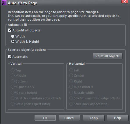
The Auto-fit dialog controls how items move or stretch as the page size changes.
The Auto-fit all objects checkbox controls the automatic behavior of all items in the document. The dialog defaults to Automatic for all items in your document, but you can control the behavior of individual objects using the settings in the lower panel.
The Auto-fit all objects checkbox turns the feature on. Bear in mind that even if this option is un-checked existing documents that had items marked as footers, or to stretch, will continue to behave as usual. This option just enables a more comprehensive, automatic positioning of items on the page.
Width only or Width & Height
There are two distinct use-cases where you might want automatic positioning of items on the page:
- Websites, particularly 'blog' style websites where the pages are of variable length, depending on how much text you have. Here you do not want the position of items on the page (typically at the top of the page) to be moved as the page grows. In this case select the Width only option. This means things will be re-positioned when you change the page width, but not when the page height changes.
- Print documents, Social Media documents or Presentations, where you want things to re-position and stretch (automatically adapt) whenever the page width or height is changed. In this case select the Width & Height option. This is the default when you enable Automatic Fit.
So to summarize for most document types, print, presentations and social media, select Width & Height. For websites choose the Width only option.
Click Apply to effect the change - you can now test the result by dragging the right or lower page edge to see how things move as you adjust the page size. Or alternatively in the Page Options dialog, select from drop-down list of common page sizes.
Auto-fit for individual page objects
Once you have enabled the Automatic fit option you can control the behavior of individual objects on the page. By default everything is marked as Automatic.
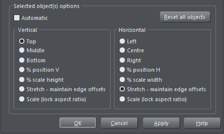
To control the behavior of individual objects just select the item you want to control, un-check the Automatic checkbox - which will enable all the lower panel settings. You can now set the position rules for your selection.
Again click Apply to effect the change - and now test the result by dragging the right or lower page edge to see how things move as you adjust the page size. Or alternatively in the Page Options dialog, select from drop-down list of common page sizes.
The options are...
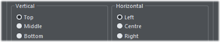
The Top, Middle and Bottom options for vertical adjustment and the corresponding Left, Center and Right, for horizontal adjustments will keep the items the same size (so won't be stretched, enlarged or shrunk) and at the same position relative to the edge or center of the page.
So items marked to be Top, will stay at the same current absolute position to the top edge. Items marked as Left will remain positioned at the left edge of the page.
So if you want a footer to remain at the exact same vertical size and vertical position relative to the bottom of the page, set the vertical options to be Bottom. Similarly if you want an item, perhaps a logo, to remain at the exact same offset in the top right corner, irrespective of page size, then set it to be Top and Right.
% Position

Items marked with either of these options will not change size as the page is enlarged or shrunk, just be moved to remain at the same relative position on the page. For example an item that is 1/3rd of the way across the page will always be 1/3rd across the page.
% Scale height or width

This is like the Automatic option - but applying to the selection only, where position and stretch occurs with page width or height change.
Maintain edge offsets

This option is useful where you want a fixed gap between the edge of the page and the item.
Scale (Locked Aspect Ratio)

Items enlarge or shrink as the page size enlarges or shrinks but retain the same aspect ratio.
Reset all objects
This button will remove any and all manually auto-fit settings you have on everything in the document. This puts everything back to the Automatic setting.
An Example
This is a relatively simple social media graphic that is adaptable to just about any page size. With the Automatic options it would work, but the border width and height would not remain the same. So in this case specific items on the page have been marked to behave differently.

|
|
Photo: set to Stretch - maintain edge offsets. |
|
|
Center text panel: Automatic - text is set to center vertically and horizontally. |
|
|
Background rectangle: set to Automatic. |
|
|
Footer text panel: set to Bottom and % scale width. |


Previewing and testing Auto-fit pages
A great way to test the adaptability of your page design is to preview and test using the Page Size dialog - right click on the page background - select Page Options... and then the Page Size tab.
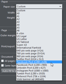
In the Page Options dialog - the Paper size field has a drop-down list of common page sizes.
So you can select a preset paper size from the drop down, but a much easier way is to unlock the page, which allows you to drag the width and height to any desired value. To enable page size dragging, just un-check the Lock page size option. Now if you move the mouse pointer near the right or bottom edge of the page, the pointer changes to indicate you can drag the edge to resize.
Resizing picture and text
It's important to understand that when a page is stretched (e.g. if you drag the right edge of the page to be wider), text items and images are resized, but the program does not distort the text or images. There's nothing worse than a photo that has the wrong aspect ratio, or stretched text.
So in the case of text objects, when the container of the text is resized, the text just re-flows within the new container size. So, for example, changing a page from A4 portrait to A4 Landscape the body text is not stretched, it remains the same point size, but the text frame is stretched.
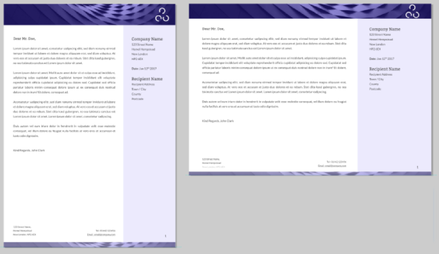
In the example above the page is made wider (and less tall). The text remains the same point size, but the text frame, and other items on the page have been resized in proportion.
This is the out-of-the-box behavior when everything is set to Automatic. Using the manual controls you can optimize the behavior, so that for example the width or height of items can be fixed. In the above example you can see the height of the header and footer has become reduced as the page height has reduced. This might not be what you want, and this is where the individual Horizontal and Vertical controls come into play - as described.
Resizing text
If the page is made taller AND wider, then the text will be resized. The example below shows a small page on the left, and a much larger Facebook post size version, with approximately the same aspect ratio on the right. If we did not scale the text, then the Facebook one would have unreadably small text.

Tip:Always design for the smallest page size, it's easier to enlarge a format than to shrink it.
Tip: Don't fill up your text boxes - leave room for content to flow.
Copyright © Xara