Image Tab in Website Properties

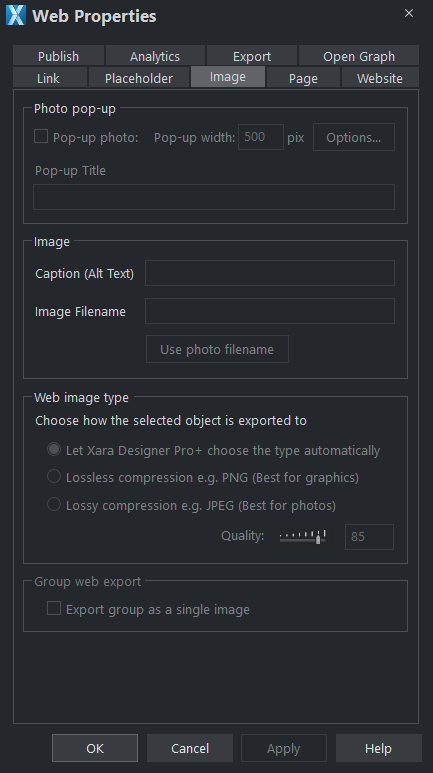
Photo pop-up
This section of the Image tab lets you add pop-up photos and other photo gallery features to your web page easily. Simply import your photo and use the Selector tool to scale it right down so it appears as just a small photo thumbnail on your webpage. Then with the photo still selected, select the Pop-up photo checkbox on this tab. Choose the size you would like for the pop-up photo by entering a value in the pop-up width field (default 500 pixels). Preview your page and click on the photo thumbnail on your page, to see the pop-up photo appear.
When you turn on the pop-up photo feature here in the Image tab using the checkbox, the corresponding option on the Link tab is also automatically selected for you. That's because a click on the photo will show the pop-up photo, so you can't also set any other clickable link on the same object. So any link you previously setup on the object, using the Link tab, will be removed.
One big advantage of these photo pop-ups over pop-up layers (as described in the Link Tab section above) is that the large photo is only loaded by the web browser when the visitor clicks on a thumbnail. Therefore this method is much more suited to presenting a large number of photos on a gallery page, because only the small thumbnails are loaded initially, making the page load quicker.
Note that this feature works on objects other than photos, such as shapes and groups, but can't be used directly on text. You can put text inside a group (Ctrl+G) to work around this restriction.
Pop-up title
Give the selected photo a title using this field and it is shown above the pop-up photo. Note that you also need to turn on this title option in the Pop-up photo options dialog (see below), because titles are not shown by default.
Popup Photo Options
Click the Options button to bring up the Pop-up Photo Options dialog. Here you can choose from a variety of options that change the way your pop-up photos are presented.
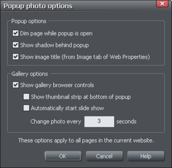
Popup Options
The following options change the appearance of the popup photo.
Dim page while popup is open: With this option selected, the entire page is dimmed whenever a popup photo is displayed. This helps emphasize the popup photo, so that it stands out against the darker background of the page.
Show shadow behind popup: This option puts a drop shadow behind the popup photo window, again to help make it stand out against the page background.
Show image title: If you have entered title text (see above) for each of your photos, this option causes that title to be above the popup photo.
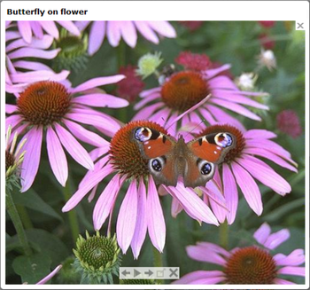
Note that title text is separate to any caption text, which appears below the photo. See below for information on setting caption text.
Gallery Options
The following options turn on gallery features for your popup photos.
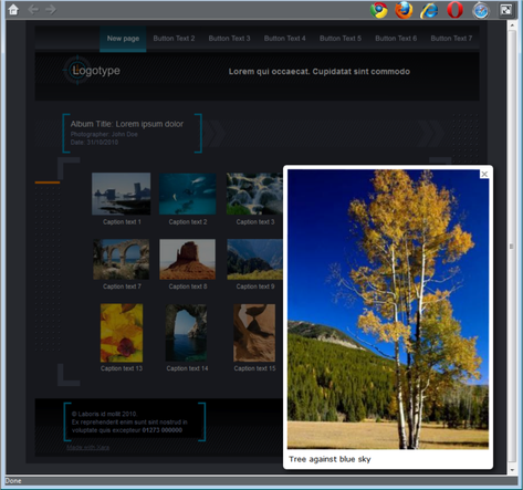
Show gallery browser controls: Turn this on to show gallery controls on your popup photo.

This appears on top of your photo whenever the mouse pointer is over the photo. It allows your site visitor to view the other popup photos in the current page, without having to close the popup window and click on the thumbnails for the other photos. The visitor can move to the previous or next photo, or start and stop an automatic slideshow where each photo is shown for a few seconds before moving onto the next.
Show thumbnail strip at bottom of photo: With this option on a strip of small photo thumbnails appears below the popup photo window. This allows the visitor to jump to any of your popup photos by just clicking on the thumbnails in the strip, again without having to first close the popup photo window.
Automatically start slideshow: Turn this on if you want a slideshow to start as soon as the user clicks on any of your popup photos. You can also choose how many seconds each photo should be displayed for when the slideshow is playing.
Note that the only photos included in the photo gallery are those photos on the current page which are setup as popup photos. Any other photos on your page will not appear in the gallery, so make sure you use the Link tab of the Web Properties dialog to turn on the popup photo option on any photos that you want to be included in the gallery.
Image Captions (Alt Text)
You can optionally show a caption below each pop-up photo. Enter the caption text in this field in the Image Tab.
Note that this feature works on objects other than photos, such as shapes and groups, but can't be used directly on text. You can put text inside a group (Ctrl+G) to work around this restriction.
This text is also used as the "ALT" text on the image that is exported for the currently selected object, whether or not the image also has a pop-up. Web browsers show this text on the page in place of the image, if the image can't be obtained for some reason.
Note: Alt Text is considered important for good SEO.
For more SEO suggestions see How can Xara help with my SEO?
Image Filename
Here you can set the image filename to be used on export. You don't need to enter the extension of the image format as Xara will do this automatically on publish of your website.
Note: Giving an image a descriptive name such as "beach-sand-water-sunshine" is useful for SEO purposes. Often the original file name is not useful for this purpose, for example most photos from digital cameras, but sometimes the photo’s original filename is useful so there is a 'Use photo filename' button that will instantly fill that name field for you with the selected photo’s original filename (if it has one). Only use this if the photo filename is meaningful and relevant to the content of your site.
For more SEO suggestions see How can Xara help with my SEO?
Group images
By default, existing groups and new groups are set to Separate images for group members and the group members will export individually as if they were not grouped at all.
This is especially useful for groups containing text, so the text remains as text in the published site.
You will also be able to set properties on the objects inside the group. You can use Ctrl+click to select objects inside the group and then apply links, reveal animations, etc. to the group objects.
It's not advisable to use this option on very complex groups such as artwork that is made up of tens or even hundreds of vector shapes. It's more efficient for such groups to export into the website as a single image using the One image for whole group option. But for simpler groups such as a group of photos, it's best if they are set to export separately because then each object can have its own individual settings. For example each photo could be set to be a popup, or have its own reveal animation.
Use the One image for whole group option when you want grouped objects to be exported as a single image in your published website. For example if you group a photo with its caption text, the whole group appears as an image in your website, so the text is not selectable in the web browser.
Web image type
Due to the nature of HTML websites, most objects you see and can select on the page in Xara have to be converted to bitmap images during the process of exporting your website. This all happens automatically for you when you preview and export, but the controls on this tab give you some control over how these images are created.
Remember that each group, shape, heading, logo, photo, panel background, etc. is exported as a separate image. By looking at how the objects in your design are grouped, you can control how many images are exported to make up your website. So for example if you have 2 separate shapes in your design which are not grouped together, they will be exported as 2 separate images. You can group the two shapes (Ctrl+G) and then a single image is exported instead.
This section of the Image Tab lets you specify how the currently selected object should be exported as an image. By default Xara will decide for you. This means that normally photos will be exported as a lossy JPEG (which is usually the best format for photos) and other objects as a lossless PNG (which is usually best for graphics). Photos which have been rotated on the page, or which have a semi-transparent shadow applied, are exported as PNG because JPEG does not support transparency.
You can force the selected object(s) to export as a lossy JPEG or as a lossless PNG, by selecting the appropriate option. When the lossy JPEG option is selected, you can also choose the JPEG quality to be used for that image. Higher quality means a larger JPEG file size.
If you have the Include WebP Images option selected under the Website Tab, then Xara will include and use the WebP format, which supports both lossy and lossless and can be controlled by above options. JPEG and PNG files will also still be exported for use on browsers that do not support WebP. If the option is not selected, Xara will export just JPEG and PNG.
Copyright © Xara