Color palette from photo

The Color palette from photo tool can analyze a photo, identify the most predominant colors in the image, and create a color palette of those colors. It adds or updates the theme colors in the current document accordingly. This makes it easy to match the colors in a document to those of any photo.
Simply select the photo you want to use to set the document colors, then click the icon on the Photo Tool flyout bar.
The pages below have been designed to use the standard Xara theme colors that work with the Palette from photo feature. Each of the 3 versions of the page has had the photo changed and then Palette from photo invoked to update the document's colors to match those of the photo. In all other respects these 3 designs are identical.
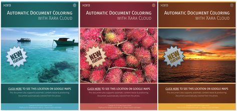
Xara instantly analyzes the photo and chooses up to 5 of the most predominant, but independent colors (very similar shades of the same color are considered as a single color). It uses these to set the values of the named colors Theme Color 1 to Theme Color 5. If these colors are already in your document, as they probably will be if you used a Xara template, they are updated. Otherwise they are added and you will see them appear at the bottom left of your color line.
If the graphical objects that make up your document don't use these standard Xara theme colors, then you won't see those objects change color. So make sure your document uses the standard theme colors, and shades of those colors, to make your document easy to re-color. When there are limited numbers of significant colors in the image, the program uses shades of gray for the lower theme colors.
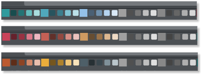
The 5 theme colors for each of the 3 examples above - together with their lighter and darker linked colors.
Using Theme colors
It's always good design practice to limit the number of different colors within a document. But the use of shades of your predominant color is to be encouraged. To help make the use of lighter and darker shades, the program creates two linked paler, and two darker shades of each of the Theme Color 1 to 5 colors. You can see in the above examples the use of brighter and darker shades of Theme Color 1 and 2.
The color analysis is based on an algorithm that determines the predominant colors based on their brightness, and coverage area. It automatically combines similar shades. For example, a blue sky typically contains many lighter and darker shades of the same blue hue. So this would be created as a single blue color. It also adjusts the brightness of Theme Color 1 and 2 (the two most predominant colors) so it always provides a good contrast against a white page background.
This means you can always use Theme Color 1 as a heading color, for example, and it will be readable. Or, alternatively you can place white text on Theme Color 1 or 2, perhaps a colored rectangle of Theme Color 1 or 2, and that text will also always be readable.
See Theme colors for more info on the color schemes.
Text Color
Another common technique designers use, is to link the main text color to the predominant theme color, although obviously this needs to be dark enough to provide enough contrast to be legible. Therefore Xara also creates a named color call Text that could be used for the body text of your document.
Extracting Colors from Logos
This feature also works with any image - including transparent PNGs so, for example, if you add a company logo graphic to your page that includes your brand colors, you can automatically set the Theme Colors to match those used in your company logo.
Customizing
You can customize the named colors the usual way. Right click on the color patch on the color line, and select Edit.
Copyright © Xara