Modular Websites and Web Blocks
Whether you need a simple landing page or a full featured e-commerce website, we guarantee that Modular Websites will offer the quickest and easiest way to create that showstopper website that you’ve always imagined.
A Modular Website page is very simple; it’s just a vertical stack of ready-designed Web Blocks, one above another, with navigation controls at the top. Websites can be built very rapidly by just adding as many different Web Blocks as required to build up a web page. Add your content and you’re done. What’s more a mobile-friendly variant of the website is created automatically.
To get started with your Modular Website, you can choose one of the pre-built website templates from Elements and add/remove Web Blocks to customize it. Or you can begin with a Start Page which has just the navigation, and then drag and drop Web Blocks from the Designs Gallery one by one to build up your website.
All the capabilities for building websites without Web Blocks (‘Freeform Websites’) are available for more advanced users, but you will find that using Web Blocks is the simplest, quickest way to build your new dream site - from Xara or anyone else!
Check out our intro movies in the Web Blocks Playlist on YouTube.
Getting Started: Choose a Template Website or Start Page
Ready-made website templates can be found in Elements or Designs Gallery, under Modular Websites > Website templates.
Or if you want to start with just the navigation and build up your website yourself, choose a Blank (website) from Modular Websites > Website Templates. There is also a blank Modular Website template, with just navigation, under File > New.
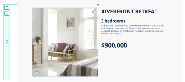
Adding Web Blocks
You’ll find a wide selection of different Web Block designs in the Designs Gallery under Modular Websites > Web Blocks . Double-click on an item in the Design Gallery to add it to your website document. Each new block is added to the bottom, below all your existing Web Blocks. Or use drag & drop to insert at any position. You can then add your own content by editing text using the Text Tool, replacing images, etc.
Working with Web Blocks
Whenever you click on an object that is part of a Web Block, you’ll see a green Web Block bar appear to the left of the page, as shown below:
Objects can be selected inside the Web Block with one click, then you can edit objects using the usual tools on the main Toolbar on the left; Text Tool for text, Photo Tool for photos, etc.
To select the Web Block itself, click on the Web Block bar. A green outline around the whole Block shows that it is selected, and the Web Block bar is brighter.
Deleting a Web Block
To delete an entire Web Block that you don’t want, simply select it by clicking the green bar and Delete. When a Web Block is deleted, any Blocks below it are automatically moved up to close the gap.
Changing the order of Web Blocks
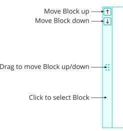
Use the arrow buttons on the Web Block bar to move Web Blocks up or down. Or you can click-drag on the center of the bar and drag the block up or down. As you drag, a horizontal line appears between Web Blocks, to indicate the drop position.
Adjusting the height of a Web Block
Many of the Web Blocks can have their height adjusted by click-dragging on the bottom edge of the Block, as shown below:
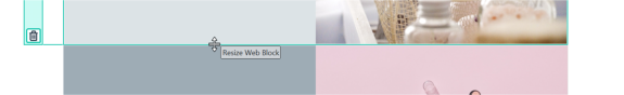
Note the Web Block needs to be selected first (click on the green bar). Then move the mouse pointer over the bottom edge and you should see the mouse pointer change as shown above.
Copying Web Blocks
To copy a Web Block, select it by clicking on its Web Block bar and then use Copy (Ctrl+C) as you would for any other object. When pasting, the Web Block will appear immediately below the selected Block, or at the bottom of the website if there is no selection. You can copy and paste Blocks from one Modular Website document to another.
Types of Web Block
There are two different types of Web Block, Flexible Web Blocks (Flex Blocks) and Freeform Web Blocks.
Flexible Web Blocks
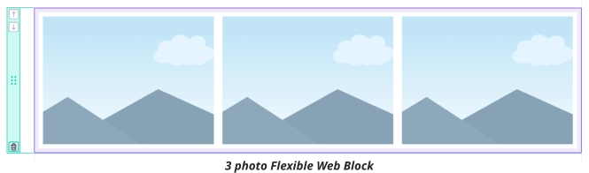
Flexible Web Blocks are Web Blocks that arrange objects inside themselves automatically, according to some simple layout rules that can be set on each variant of a Web Block. As more objects are added to a Flexible Web Block, or objects are made wider, they flow onto new rows automatically, to stay within the width of the page. For example if you start with the following 3 photo Block:
and you add 2 more photos, you end up with 2 rows of photos, because there is not enough space in a single row for all 5 photos:
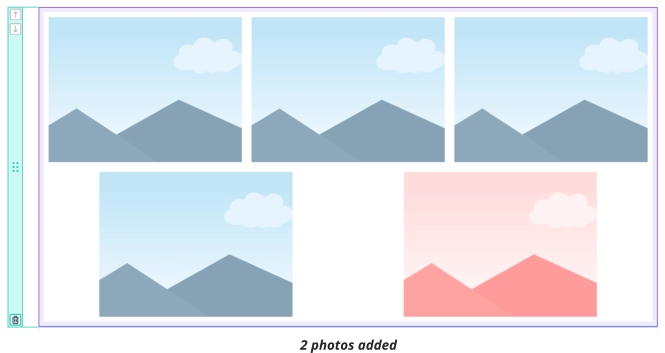
A Flexible Web Block won’t change the width of any of its objects automatically, it will just add as many rows as are required to fit in all the objects, according to the layout rules set on it. With the above example, you could simply reduce the width of all the photos so they would all fit in one row. Or you might decide to make the last 2 photos wider, to better fill the second row.
In a Flexible Web Block each variant (Main and Mobile) can have its own separate layout settings, so the same objects can be arranged differently in each variant. With the 5 photo example above the photos would typically be arranged in a single column in the narrower Mobile variant. Each time you add another object, it is shared with the other variant and positioned according to the layout rules set in each variant.
All the Flexible Web Blocks in the Designs Gallery have been created by a professional designer and so already have appropriate layout settings in both Main and Mobile variants, so most users should never need to change those settings. But if you do need to change them, this is done using the Flex Layout toolbar .
Purple outline indicates Flexible Block
Note the purple outline in the examples above. This outline is visible whenever the Block, or an object inside it, is selected and it indicates that this is a Flexible Web Block. If you don’t see the purple outline, that indicates the Web Block’s objects are positioned manually inside the Block (a Freeform Web Block).
Re-ordering objects
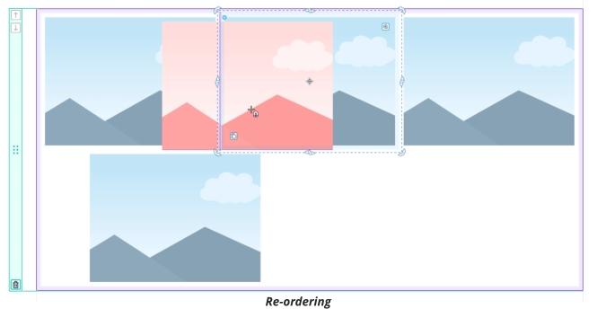
Click-dragging on an object that is inside a Flexible Web Block allows you to change the order of the objects in the Block. As you drag, a vertical purple line appears to indicate at which position the dragged object will be placed. In the example below, the red photo is being dragged from position 5, to position 2, so you see the purple line between the first and second photos as you drag:
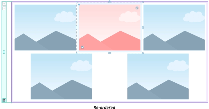
So the end result on drop will be:
Flex Block Layout Settings
A Flex Block’s layout settings are controlled using the Flex Layout toolbar and they work the same way as FlexGroups. See the help on FlexGroups for information about these settings.
Freeform Web Blocks
In a Freeform Web Block you position the objects inside it manually wherever you like. In other respects, Freeform Web Blocks work the same as Flex Blocks.
Moving objects in and out of Web Blocks
With all Web Blocks in the Designs Gallery you can now easily add new objects to them by simply dragging the object over the Block using the Selector Tool. As do this, you will see the green Block bar, to the left of the page, light up, so you know which Block you are targeting. If it’s a Flexible Web Block you’ll also see an insertion point indication, as shown above in the Re-ordering example. On drop, the object is moved into the Block. If it’s a Flexible Web Block, it will be positioned according to the Flex rules in each variant. Otherwise the object will be left where you dropped it.
Whenever you add an object to a Web Block, it gets shared automatically with the other variant, so it will appear on both Main and Mobile variants. If the Web Block is not a Flexible Web Block, you will need to manually position the object appropriately in each variant. Similarly you can also drag an object out of a Web Block, to remove it from a Block. Simply click-drag on it and move it to another Block, or drop it to the side of the page to remove it from the Block. Alternatively selecting an object and pressing the Delete key will delete the object.
Adding new objects
When you import or paste a new object into a Modular website, it gets added to the currently selected Block, or to the Block closest to the center of the view if there is no selection. However when you initially draw a new object into a Modular Website, using a drawing tool, it will not automatically be added to a Block. To add it to a Block, simply drag it over a Block, as described above.
Floating objects over Blocks
If you want to have an object floating above or below a Web Block, rather than being part of the Block, this can be done by holding down the Shift key while dragging the object over a Block. This prevents the object being added into the Block. Similarly if you move a floating object you need to hold down Shift to prevent the object being moved into a Block on drop.
Advanced: If you hold down Alt while dragging and dropping an object onto a Flexible Web Block, the object is added into the Block, but it will be outside of the FlexGroup that is inside the Block.
Widget Blocks
Some Web Blocks include dynamic content that can considerably enhance the value of your website, such as video players, maps and forms. After you’ve inserted one of these Web Blocks, click on the widget inside it and you’ll see an Edit option appear on a context menu. Click Edit and a window appears allowing you to setup your widget. See the section below on Widget Editing for more information.
Widget Editing
Now when you insert or edit a Widget you’ll see this new Widget window appear.
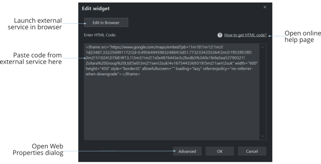
For widgets that are provided by an external service, such as a Google Map, configuration of the widget in the external service is now done using your regular browser, instead of inside a web window inside Designer+. This means that signing into the external service will generally be easier, because your browser probably has features helping you sign-in, such as saved passwords or a password manager. Also you can work in a full size browser window, rather than in a smaller web window inside the application.
Press the Edit in browser button to open the external service in your default browser. Once you’ve setup your widget, copy the widget code from the external service and then come back to Designer+ to paste that code into the widget window.
Most widgets have an online help page available, which will advise you on how best to use the external service with Designer+, how to find the code in that service and other helpful tips. Press the How to get HTML code link to open this help.
There are some lesser used widget options in the Utilities > Web Properties dialog that are not available in this new window. Press the Advanced button to jump directly to this dialog, if you need to use these options.
Copyright © Xara