Pie chart SmartShapes
You can find the Pie charts in the Charts section of Variable "Content Catalog" is not defined / The Designs Gallery . These offer a super-easy way to create a high-quality vector pie charts, with the program automatically calculating the correct percentages for each pie slice.
You can adjust the pie segment values by...
- By dragging directly on pie segment handles to adjust the % size of each slice.
- By using a Data Input Form to the enter a simple column of numbers, with optional labels
- By pasting data into the input form from a spreadsheet - you can display the values as a percentage or absolute value. It automatically positions the labels around the pie, using a common text style. Edit one label style and they all change to match (although you can apply different styles to each label if you wish).
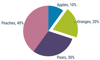
- You can 'pull out' to highlight any one segment simply by clicking on it, as shown above.
- The segment colors are based on the Theme Colors used in your document (Theme Color 1 to 5 and then shades) so the pie chart will match your document color theme.
- Or you can easily customize the color of any segment
As with all the shapes, hover over the adjustment handles to see a function description.
The top left handle (green dot in this example) opens the shape to allow data input, and you can switch between decimal and percentage values by clicking the % symbol in the data input panel. There is a 15 entry limit - but if you enter more than 15 the segment labels cleverly reformat to display an indicator pointing to the relevant segment.
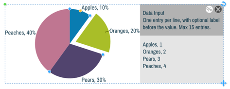
Shows the Data Input Form area. You can show / hide this using the green handle top left.
Using the Text Tool click in the lower data input area and type label/ value pairs as required. As you edit this the pie chart is updated live. Each time you add a new entry on a new line, a new pie segment is created. You can also drag the handles on the edge of the pie slices and the corresponding data values change in proportion.
You can also import data from other sources if you want to - just paste into the data input panel. The pie charts also support data taken from Excel and Google spreadsheets, just make sure you paste the data as unformatted text.
Coloring the pie chart
The pie segments use Theme Color 1 to 5 for the first five segments, and then lighter and darker shades of these colors for the next ten segments. If your pie contains more than five slices, it will use lighter and darker shades of Theme Color 1 to 5 for the next ten segments. If you do not have any Theme Color defined, the slice will appear black and you will have to manually color the segment.
To color any segment, first click it (this will pull out the selected segment), and now click a color on the Color Line.
Editing label text
If you change the whole text of any label e.g. the color, font or size, they all change to reflect this. To change an individual label, give it an alternative Text Style. You'll notice labels on the left side are left aligned and right side labels right aligned.
If you want to change the relative size of the pie to the text, use the Radius handle (orange in this example) to resize the pie.
Copyright © Xara