Text Panel SmartShapes
You can find the Text Panel SmartShapes in Elements / Designs Gallery under "Components" > "Print & Web Components". Or under the "Insert" > "Panels" > "More Text Panels… " menu.
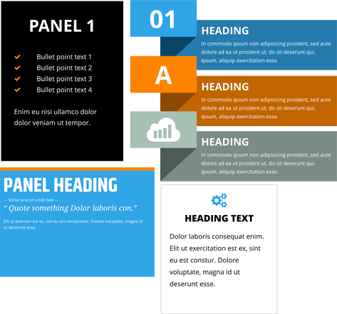
You can freely edit the text using the Text Tool. If you hover over the SmartShape control handles (display by selecting using the Selector Tool or the QuickShape tool) you will see a tooltip explaining the function of each handle. The functionality depends on the style of the panel.
Generally the panels allow you to...
- Adjust the width and height (and the text re-flows),
- Change the margin width around the text
- Round the corners of the whole panel.
- You can also rotate the whole object and it remains fully functional.
These text panels are smart in that they grow to accommodate whatever text you put in them - drag the bottom center or top center handles to change the vertical panel height. If you ever add more text than can fit into the panel at that height, the panel will grow to accommodate the additional text. But if you later remove text, the panel will shrink back no further than the height you last set using the height adjustment handles. This helps to keep panel sizes consistent, which is useful where you have a panel occupying a defined space or aligned vertically with other panels or objects of the same height.
Text Alignment
You can align text vertically within the panels, so it's Top, Center or Bottom aligned. This is useful where you have text that you want to edit regularly so the number of lines varies. To change the vertical alignment, place the text caret in the text and select the Vertical Text Alignment button on the text InfoBar

then choose an option from the menu. The Auto-fit to container option allows you to fit any text into any restricted area on a page, so it's great for text that needs to change often where there is restricted space. Shrink text on overflow will shrink the text only when it reaches the limit of the text box.
If the panel is full of text with no empty vertical space, then it will look the same no matter which of the three alignment options are selected. But the alignment setting also determines how the panel grows and shrinks, as text is added or deleted, so the setting is still relevant even for 'full' panels. Top aligned panels will always grow and shrink from the bottom, with the top edge staying fixed. Bottom aligned panels are the other way around - they grow upwards with the bottom edge fixed, so these are commonly used at the bottom of pages. And centered panels will grow and shrink equally at the top and bottom, so the center of the panel is fixed.
For more info on text area alignment see Vertically aligned text and Auto-fit to text areas.
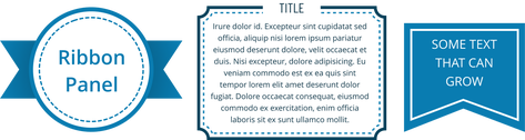
Many of the panels will allow you to change the width or style of lines or outlines included in the panel. For example the Ribbon Panel shown above allows you to change the width or style of the dashed circle inside the panel. Just select the whole panel and then use the line width control to change the line width. Or with the mouse pointer over the line, hold down Ctrl+Shift and use your mouse wheel to adjust the line width. Use the Line Gallery to change the line style, corner style, or end cap.
A collection of similar panels containing both photo and text can be found in Elements/ Designs Gallery under "Image resources" > "Photo Panels".
Header & Footer SmartShapes
Header and Footer SmartShapes are components that automatically resize and position themselves at either the top (headers) or bottom (footers) of every page on insertion. They are made repeating so they appear on every page in your design.
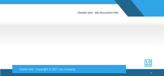
To insert a header or footer, use Insert > Header or Footer, which opens the Designs Gallery onto the selection respective component section.
If you insert a new header or footer where there is already one in place, the new footer will replace the old one and where possible, the content is maintained in the new header or footer.
Copyright © Xara