Chart SmartShapes
With the chart SmartShapes - see "Insert" > "Charts…" You can just edit the values and labels on the charts using all the usual Text Tool attributes, and the graphics update accordingly.
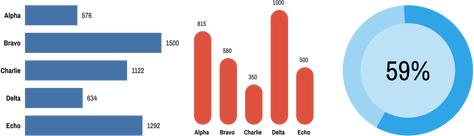
Bar Chart, Column Chart, and Percentage Ring
As with all SmartShapes, double-click to go into the QuickShape tool and you will see the SmartShape handles appear. Move the mouse pointer over each handle for a tip on what each does. On the bar and column charts there are handles for adjusting the bar width, chart width/height, the spaces between the bars, the roundness of the bar corners and of course for adding/removing bars. Each bar also has a handle for changing its position in the chart and a handle for changing its value by dragging. If you need more resolution or accuracy, just zoom in and drag. Alternatively you can enter any precise numeric value, even with decimal places, using the Text Tool.
Customizing Bar & Column Charts
You can change the colors of charts easily just by selecting the whole chart and clicking a color on the Color line. The Replace Colors dialog appears to let you choose which of the colors in the chart you would like to replace with your chosen color. Similarly you can use the Color Editor to edit the colors - the list of replaceable colors appears at the top of the color editor, so select the color you want to edit from that list.
Sometimes you may need to do more than just replace or edit the existing colors in the chart. You can select a specific bar or column by Ctrl+clicking on it in the Selector Tool. That selects just that bar/column inside the chart. Then you can change its color directly, or its outline, or even change the type of its fill using the Fill Tool. If you want to copy the style of one bar onto the other bars, first copy (Ctrl+C) the selected bar to the clipboard. Then select one of the other bars and use "Edit" > "Paste" > "Paste format/attributes".
Changing label and value text styles
The Chart labels and values can be edited using the Text Tool - you can apply the usual text attributes, to adjust the appearance of the text. When you change the appearance of a chart label, such as changing the font, font size or color, that change is immediately replicated across the other labels for each bar. However this only happens if those other labels have the same text style applied (usually Bar chart labels). So if you want one of the labels to be different, perhaps to highlight one of the bars, simply give it a different style or use the No style option in the styles menu to remove the style. The same happens with the value text.
Copyright © Xara