Layers, Mouseover (Rollover) & Pop-ups
All objects have a stacking order on the page - from the backmost to the frontmost item.
In addition, all items can be placed into named layers. Each layer can have any number of objects, and has the ability to be turned on or off. When the layer is turned off all objects on that layer become invisible.
|
|
The layers are controlled from the Page & Layer Gallery in the Galleries bar. See the Layers & Page & Layer Gallery chapter for full details. |
In website documents layers are used to provide mouseover (sometimes called rollover) features on your website. These include highlighting buttons (they highlight when you move the mouse over them) and also other pop-up effects such as effects such as a text panel containing a detailed product description.
You can also apply a transition to a layer, so that it appears on your web page in an animated way.
Mouseover Effects
There are several types of mouseover effect you can control. Firstly the one used by mouseover buttons, where any object with a web address can display an overlapping graphic object that appears on a layer called MouseOver. See below for more detail.
There is also a more powerful mouseover feature, where you can make the contents of any layer appear as your mouseover, or click any object on your page. This pop-up layer can contain text, graphics, photos or any combination of these things. More below. You can also add a wide range of animations effects.
The MouseOff and MouseOver Layers
All the main objects on your website are placed on the bottom layer, usually called MouseOff. Buttons that highlight when you move the mouse over them on the web page have an alternative graphic on the layer called MouseOver.
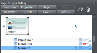
If you open the Page & Layer Gallery you can show or hide any layer by checking or un-checking the visibility icon (the eye symbol). This is a way of showing what your MouseOver elements will look like on your page.
The current layer is always indicated with an arrow in the Page & Layer Gallery - the MouseOff layer in the above diagram - and this is the layer that all new objects are drawn on. To place objects on any other layers just click the required layer in the Page & Layer Gallery, ensure the eye and the lock icon are open for that layer.
Note: The MouseOver layer must always be above, that is on top of, the MouseOff layer, as shown in the above example.
To edit the objects on a layer both the 'eye' and 'lock' icons have to be open - this means you can see and edit the layer (as shown above in the MouseOff layer).
Mouseover (Rollover) Buttons
Some of the ready-made buttons in Elements have a mouseover effect. These are created by having two versions of each button, the main one on the MouseOff layer and a 'highlight' one on the MouseOver layer.
Normally you do not need to know or care about this because both buttons behave as one - the changes you make to one, such as editing the label text, are reflected on the other version. If you move, drag or resize a button on the MouseOff layer, the other version on the MouseOver layer will change as well, even if you can't see it. This is done using Soft Groups.
Creating Your Own Mouseover Buttons
You can create your own mouseover buttons from scratch by drawing the necessary elements from rectangles, text, etc. Just draw the main parts of the button on the MouseOff layer (remember to group it) and place the corresponding 'highlight' version on the MouseOver layer. As long as the MouseOff version has a web address link, then the MouseOver version will automatically be displayed as you move the mouse over it on the web page. (The MouseOver layer must be on top of the MouseOff layer).
|
|
In other words, you give the main object a web address using the link option, and then select the MouseOver Layer in the Page & Layer Gallery, and place the required mouseover versions of your button on this layer so it overlaps the linked object. |

Technical note: Any graphic object on the MouseOver layer will be displayed as long as at least 50% of it overlaps with the object on the MouseOff layer. The two versions of mouseover buttons are kept in sync by using the Soft Groups feature. When you select the button on one layer, it automatically selects the Soft Grouped version on the other layer, even if the layer is switched off. When you edit the text of the button on one layer, it's automatically synced with the other version of the button.
To ensure the text on both the Off and Over states changes when you edit either, Soft Group the buttons on both layers. To do this you will need to enable both layers in the Page & Layer Gallery, and lasso select around both buttons. The status line should tell you if you have everything selected. Select "Arrange" > "Apply Soft Group". Now when you edit the text on the Off layer it will also change on the over layer, even if it's hidden. (Note this only works if the Off and Over text are the same to start with, and relies on the objects being Soft Grouped).
Once you have a working button, you can easily turn it into a navigation bar. Select the button (along with its MouseOver state if it has one) and then choose "Arrange" > "Create navigation bar". The navigation bar dialog appears allowing you to configure your bar. See the Navigation Bar chapter for more information on this, including how to have different first and last buttons in your bar.
Layer ordering in website documents
If your website document has mouseover effects, pop-up layers and perhaps even mouseover effects on those pop-up layers, there are some important rules you need to follow in terms of how you order the layers in your document.
Considering the layers in turn from background to foreground (which is working upwards in the Page & Layer Gallery), first you must have all the static layers. These are layers which are always visible and are not used as pop-ups. In most designs there will only be one – the "MouseOff" layer. But some designs may have several, in which case they must be the first layers in the layer stack.
Next comes the MouseOver layer, if there are mouseover effects on the static layer(s). This contains the mouseover states for all your mouseover buttons. This must be followed by the "MouseDown" layer, if you have mousedown effects on the static layer(s).
Next you may have a pop-up layer. If the objects on this pop-up layer have mouseover effects, then the next layer following the pop-up layer must be the layer holding those effects. It must have a name that begins with "MouseOver", E.g. "MouseOverPop-up1". And then if the pop-up layer also has mousedown effects, a layer whose name begins with "MouseDown" must follow containing those effects.
Then you can have another pop-up layer, followed again by any mouseover and mousedown layers for that pop-up layer. And so on - you can have as many pop-up layers as you like.
MouseDown pop-up n
MouseOver pop-up n
Pop-up layer n
...
MouseDown pop-up 1
MouseOver pop-up 1
Pop-up layer 1
MouseDown
MouseOver
Static layer n
...
Static layer 2
MouseOff
Note that you only need to be concerned with these ordering rules if you are building complex pages with multiple pop-up effects! If you are just using the template designs provided in Elements, you should not have any problems with layer ordering.
Pop-up Layers
A more powerful alternative allows you to display the contents of any layer as a result of mousing over, or clicking, any object. This can be used for a range of different pop-up effects such as pop-up photos, menus or detailed object descriptions.
To do this, place all the objects you want to pop-up on a new layer (in the Page & Layer Gallery click New - don't use the MouseOver layer), then set the Mouseover property (Web Properties dialog) of the original object to trigger the display of this layer when you mouseover any other object. For example you can make a pop-up, like this, appear as you mouse over some text:
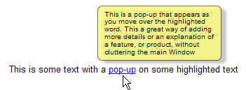
Here are the steps to create a pop-up text block like this:
- Select a layer in the Page & Layer Gallery and click New to create a new layer.
- Draw a rounded rectangle with the Rectangle tool, click a (pale) color patch on the Color Line to give it a fill color. For good measure give it a soft shadow (select the Shadow tool and just drag on the rectangle).
- Create a block of text on top of your rectangle. Select the Text tool and drag diagonally across the rectangle. Type your text. You probably want to hide the pop-up layer now, so click the eye icon against your new layer in the Page & Layer Gallery.
- Back on the base (MouseOff) layer (click it in the Page & Layer Gallery to set this as current layer) now select the text you want to trigger the pop-up, using the usual method (in the Text Tool). Then open the Web Properties dialog (Ctrl+Shift+W) and on the Mouse-over tab select the new layer from the 'Show popup layer' drop down menu. Click OK.
- Preview and test your mouseover effect.
If you want the pop-up to only appear when you click, then select the same option on the Link tab of the same Web Properties dialog instead.
Note: The mouseover layer appears and disappears as you move the mouse pointer on and off the triggering object. If you use a click method to display the layer (from the Link dialog), then the layer is revealed by a click on the object, and is hidden when you click anywhere else on the page.
Thumbnail Photos With Pop-ups
You can very easily create small thumbnail photos that when clicked will show an enlarged version. Simply resize your photo to be small, the usual way using the Selector Tool.
|
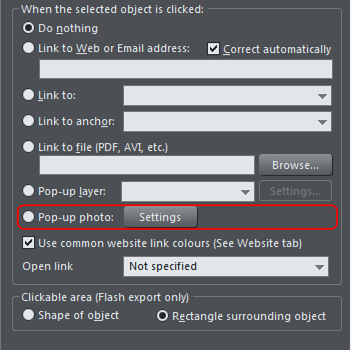
Select the small thumbnail photo, and select the Pop-up photo option in the Link tab of the Web Properties dialog (click the Link button in the Web Toolbar). |
|
Click the Settings button next to the popup photo option, to change to the Image tab of the Web properties dialog.
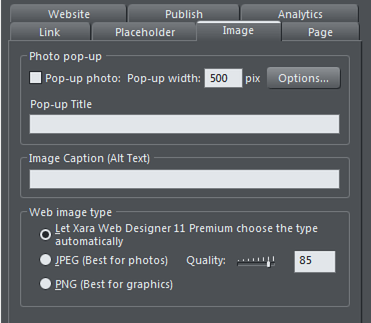
There you can change how your pop-up appears. One option allows you to place a title above each pop-up photo. Set the title for each photo using the Title field. You can also optionally show a caption below each popup photo. Just set the Image Caption (Alt text) for the thumbnail on the same dialog. See the popup photo section of the Web Properties Dialog chapter for full details of the options available.
Applying settings to popup layers
You can apply a transition to a popup layer to control how the layer appears, as well as choosing how the popup layer closes.
- Click the layer in the Page & Layer Gallery and click the Properties button at the top of the gallery.
- Click the Pop-up settings tab of the Layer properties dialog.
- Choose an effect from the Transition effect drop-down list and move the slider to set a speed for the transition in seconds.
- Choose how you want the popup layer to close using the check box. Leave it unchecked if you want the popup layer to stay open until you close it manually, or else check the box if you want it to close automatically when you click on another part of the webpage.
- Click apply.
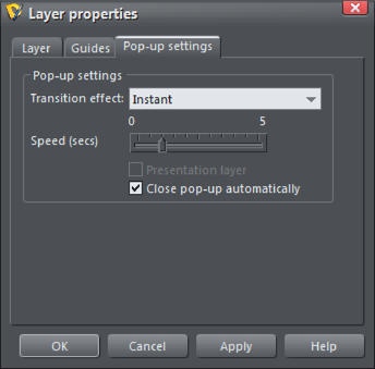
Note: The mouseover layer appears and disappears as you move the mouse pointer on and off the triggering object. If you use a click method to display the layer (from the Link dialog), then the layer is revealed by a click on the object, and is hidden when you click anywhere else on the page (or when you click on the pop-up layer's close button if you have turned off the "Close pop-up automatically" option shown above).
Copyright © Xara