Applying text attributes
Changing the font size
|
|
There are several ways to change the font size: |

- Type a new value into the size text box on the InfoBar and press Enter.
- Or select from the Font size drop-down list on the InfoBar.
- Or use the Font size pop-up slider.
- Or manually increase/decrease font size with the "Ctrl + Shift + >" and "Ctrl + Shift + <" keyboard shortcuts. This applies only if all selected text parts are of the same font size.
- Or use the Selector Tool to scale the whole text object.
Bold & Italic
|
|
Click the Bold or Italic button on the InfoBar ("Ctrl + B" or "Ctrl + I") |

This applies the bold or italic variant of the current font.
Text Underlining
|
|
Click the underline button on the InfoBar to apply an underline to the selected text. |

The underline color and size is automatically derived from the text color and size.
Underlining links
When you add a web address URL to some text, see the Web address dialog. You can decide to automatically underline all links. This is a check box option on the web address dialog ("Ctrl + Shift + W"). If you select this all linked text throughout the document is underlined, and the underline command does not affect this.
If you apply a URL to a group that contains some text, then the text will not be underlined.
Text Strikethrough
|
|
Click the strikethrough button on the InfoBar to apply a strikethrough to the selected text. |

The strikethrough color and size is automatically derived from the text color and size.
Highlighting text
To apply a text or paragraph background color - in effect a highlighter-style background color...
- Highlight some text using the Text tool
- Right-click on a color in the Color line
- Select Set Text Background or Set Paragraph Background from the menu
See Applying a Text Background color for more details.
Justification or text alignment
Justification always applies to the complete line. Any selected region is ignored.
|
|
Left justification: Align the left-hand edge of the text to the initial click position. |
|
|
Center justification: Centers the text around the click position. |
|
|
Right justification: Align the right-hand edge of the text to the initial click position. |
|
|
Full justification: This only applies when text is along a curve or in a column and when there is at least one full line of text to justify. |


When using simple text the initial click position on the page is taken as the origin for text justification.
Ligatures

A ligature is a connection between two or more characters to improve legibility or for a stylistic flourish. The linked sequences of characters then appear as a single glyph. Ligatures, where they exist, are contained within the font file and can be displayed according to the settings on the Open Type Ligatures button on the InfoBar. The ligature settings can be used in text styles just like other text attributes.
The various options are...
|
Standard |
Only the default set of ligatures provided by the font designer will be displayed.
|
|
|
Ligatures off (left) and on (right) |
|
Discretionary |
The discretionary ligatures are decorative - to be applied at the discretion of the user.
|
|
|
|
|
Historical |
Historical ligatures are mainly ornamental suggesting a historical context.
|
|
|
|
|
Contextual |
The glyph applied depends not only on the actual characters replaced but also on the context in which those characters appear. So the actual ligature used for a given character combination may vary depending on what characters precede and follow the combination that is replaced. |
|
|
|
|
Select All |
All available ligatures for a particular font will be displayed. |
|
Clear All |
No ligatures will be displayed. |


You can choose which groups to turn on or off independently for any range of characters. Select a character range in the Text Tool and then click on the Ligatures button.
If you select some text and move your mouse pointer over the different options in the Ligatures and Stylistic Sets menus, your text will update dynamically to show you a preview of what the option will do. This makes it easier to see the effects the different options will have on your text if you choose to apply them.
Stylistic Sets

Some fonts include alternative sets of ligature characters that the user can choose from, allowing more flexibility. If any sets are available for any of the characters in the current text selection, they are listed under the Stylistic Sets menu, where they can be turned on and off independently. Select text and mouse over for a dynamic preview.

Font Gabriola (left) and with stylistic set applied (right)
Open Type Alternates

Some Open Type fonts provide alternative glyph designs for the same ligatures. Click the button to see a menu containing the various options.
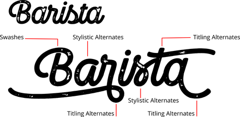
Font Camper Print Script 3 with no alternates (top) and with alternates (main).
As with the Ligatures and Stylistic Sets menus, if you select some text and move your mouse pointer over the different menu options your text will preview automatically.
The menu options are...
None
No alternates are displayed.
Contextual Alternates
Use the Contextual Alternates menu option to turn the alternates on and off for any character selection. In this example you can see the different glyphs used in the same word.

Contextual Alternates off (left) and on (right).
When you change this option, if you don't see any differences in the selected text that's because the font you are using doesn't have any alternates for the characters you have selected.
Titling Alternates
When this option is turned on, default character glyphs from the font are replaced by alternative glyphs designed to look good at larger sizes. So they are intended for use in headings and titles, but you can use them anywhere. Not all fonts provide these alternates and not all characters in the font may have them.
Stylistic Alternates
Turn this option on to see alternative glyphs that may be provided with a font for some characters, as an alternative to the default glyphs. Experiment with these alternatives for different aesthetic or design effects, where the font provides them.
Swashes
Swashes are highly decorative or ornamental glyphs, typically with elaborate flourishes.
All
All the available alternates for the glyph are displayed.
Text Capitalization

Click the Text Capitalization button on the Advanced text bar to access the capitalization options.
The options are...
|
As Typed |
This is the default setting for all text, the case remains as whatever you typed. |
|
ALL CAPS |
Text is always all upper case, whether it was typed as upper or lower case. |
|
all lower |
Text is always all lower case, whether it was typed as upper or lower case. |
|
Initial Caps |
The first letter of each word is capitalized. |
|
Small Caps |
Characters that were typed as lower case are shown as small upper case characters. Characters that were typed as upper case will appear as normal, so slightly larger. |

Many OpenType fonts actually include special character glyphs for Small Caps and if the font you are using does, then Xara will use them, so you will see Small Caps text appear exactly as the font designer intended. If the font you are using does not provide its own Small Caps character glyphs, Xara will use the font's ordinary upper case characters, but at a reduced size. Therefore you can safely use this option with any font, whether or not the font has Small Caps support.
These options are all text settings, so they not only change the case of the selected text, they are also applied as settings to the text so that subsequent editing maintains the case setting you've chosen (in the same way that the Bold and Italic settings on text work).
These settings also work with text styles, just as all other text settings do, so for example you can define a heading style to always appear in Capitals by applying ALL CAPS and then updating the style definition.
Toggle case
This option is shown in a separate section of the menu because unlike the other options above it is not a setting - it simply toggles the case of each letter in the selected text.
Subscript & superscript
|
|
Click the appropriate button on the InfoBar. Normal text subscriptsuperscript |

Adding page numbers
To add page numbers into your document - use the Insert menu to select Page number and choose a number format and a page position from the Insert page number dialog.
By default the first page of your document will be 1, but if you have pages which you don't want numbered at the start of the document, like contents or acknowledgments pages, then you can get round this by giving the first page a - (minus) value. So if you have three pages of content that you don't want numbered, enter -2 into the First page is: field, and then the pages you want to be numbered will start at 1. The sequence will be...
-2, -1, 0, 1 etc.
Then delete the minus and zero page numbers from your document. If using numeral values the - (minus) number will be replaced by a #.
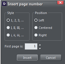
Insert page number dialog
If you want to be more precise use the Text Tool to click in your document page at the place you want the page number to appear. Right click and select Insert. Then select one of the available number formats from the dialog box. As you add pages to your document the page numbers will update incrementally.
You will need to make the page number a Repeating Object, for a page number to appear on every page of your document. If you move or change the style of the number on one page then those changes will be applied to all pages automatically.
After inserting the page number on one page, select it using the Selector tool and then select "Arrange" > "Repeat on all pages", to place it in the same position on all pages. You can still delete the number from some pages if you don't want the number to appear on every page.
Line spacing
|
|
Line spacing allows you to change the space between two lines (so affects vertical spacing). |

Line spacing is measured in percentages (120%) or points (12pt). You can either type the line space value in the text box or click the arrows to nudge the values.
A percentage setting has the benefit of scaling accordingly if you change your font size. If a percentage is applied to a line of text with more than one font size, the largest font size is used. For example, if a line contains 90% and 100% text, the line spacing is calculated on 100%.
Indents and Outdents
|
|
Indent a paragraph of text. |
|
|
Outdent a paragraph of text. |


Paragraph Spacing
|
|
The last two fields on the end of the Text Tool InfoBar allow you to set the spacing above and/or below paragraphs. |

This is particularly useful where you want half line spaces between paragraphs.
Like Microsoft Word, when you use both spacing above and below paragraphs, the spacing between paragraphs is whichever is the greater value (it's not cumulative). Paragraph spacing above paragraphs will move the first paragraph down in a frame of text.
Keep With Next Paragraph

On the Advanced text bar - this is one of the Paragraph Options - it's typically used to prevent the heading preceding a paragraph appearing right at the bottom of a page, with the first line of the following paragraph text appearing at the top of the next page. When this option is switched on for a heading, the heading will flow to the next page/column if there is not enough space for at least one line of text following it.
The option is on by default in the heading styles of all the blank print templates (under "File" > "New"), so you don't need to turn it on for new blank documents you create.
Whenever you have a print document with text flowing from one page to another, you will normally benefit from having this option turned on for all your heading styles. To update an existing document to use the feature, first select a heading and turn the option on. Then update the heading style for that heading, using the update style option in the Text Styles menu. Do the same for each different heading style you use, to make sure you are never left with a heading on its own at the bottom of a page.
Keep Lines Together
On the Advanced text bar - this is one of the Paragraph Options - its prevents a paragraph from being split across a page or column boundary. For example if you have an important 2 line paragraph such as a long heading, you wouldn't normally want the second line of text to flow to the next page, leaving the first line at the bottom of the previous page. Turning this option on makes sure that the 2 lines will always stay together.
As with Keep With Next Paragraph, this option is on by default in the heading styles of all the blank print templates. Update the heading styles in your existing documents in the same way as described for Keep With Next Paragraph, above.
Widows and orphans
The last entry on the Paragraph Options menu is the Widows and orphans option. Check the option to prevent the first line of a paragraph being left behind on one page when the rest of the paragraph has flowed onto the next page (an orphan line). And similarly it prevents the last line of a paragraph flowing to the next page on its own (a widow line).
The option works the same way whether text flows from one linked text area to another (as in multi-column pages), or from page to page.
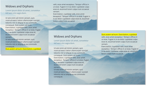
An orphan (highlighted) joins its paragraph when Widows and Orphans is applied
Baseline shift
|
|
On the Advanced text bar - Baseline shift allows you to move part of a line up or down. Positive values move the text upwards, negative downwards. |

The baseline is the imaginary line at the bottom of characters.
Select the characters for which you wish to change the baseline shift then enter a value in the Baseline shift text box.
The effect of selecting D-H and then applying an upwards baseline shift (i.e. 5pt).
Baseline shift is measured in points but you can use any of Designer Pro+'s standard measurement units. Note that baseline shift is an absolute value, in points, and does not change if you change the font size.
Tracking
Whereas kerning (see below) changes the spacing between two characters, tracking (on the Advanced text bar) changes the spacing equally within a region of text. An EM is the width of the capital letter "M" in the current font and font size. It is therefore relative to the font size and not a fixed value.
|
|
|

From the keyboard you can increase or decrease the tracking by pressing "Alt + Right arrow", or "Alt + Left arrow". Each key press changes the tracking by 10/1000.
Kerning
|
|
On the Advanced text Bar - Kerning lets you alter the space between two characters (so affects horizontal spacing). |

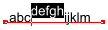
Most good fonts have auto-kerning which means they already move appropriate pairs of characters together slightly, as you can see from this diagram:

Auto-kerning off Auto-kerning on Manual kerning
Kerning is measured in "ems" (enter values in 1/1000ths of "ems".) You can either type the kerning value in the text box, or click the arrows to nudge the values.
It shares the same key shortcuts as above. If there is just a cursor, it alters the kerning, but if there's a selected range of text, then it alters the tracking. Each key press alters it by 10/1000ths of a em.
Condensing and expanding characters (aspect ratio)
The aspect ratio (on the Advanced Text Bar) is the ratio between the heigsht and width of the text. Ratios over 100% make the text wider than normal; under 100% make the text narrower.
To change the aspect ratio:
|
|
Type a new value into the Aspect text box on the InfoBar and press "¿". |

Or use the Selector Tool to stretch or squash the complete line of text.
It is not recommended to use values below 80% or above 130%. Better to use a special condensed variant of the font family if available. Alternatively use the tracking control to adjust the spacing without distorting the actual shapes of the characters.
IMPORTANT: When creating websites, avoid changing text aspect ratio or tracking because these changes will not be reflected in the text of your website.
Advanced text properties
Right click on a text object and select "Advanced text properties…" to bring up the Advanced text properties dialog.
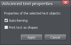
Here you can turn off auto-kerning on the selected text object if desired. See the kerning section above for information on kerning.
You can also specify that the selected text should be converted to shapes before being sent to the printer, which is useful if there are any problems printing with the font used.
Copyright © Xara